According to Denise René’s motto “the lion hunts alone”, he locked himself to reflect and engage in his painting. To control the vagaries of colors, he used pure pigments that impart energy to its quality red, orange and brilliant yellow. The combination of colors adjacented to characteristics. He worked colors values, essential for him, and overlay colors contributed to the life of his paintings.
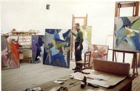
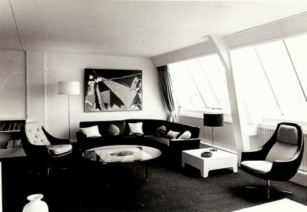
After a short stay in Belgium, he settled in Zeeland (Belgian border) in the Netherlands. He renovated a large barn in Zuidzande covered with a roof of corrugated two sides and fully glazed. A minimalist black and white decoration created a serene universe. He felt a need solitude to preserve a work introspective, closed in on himselself by absenting from the world. The geometric shapes moved in an intimate space in which light and color balance reach spirituality.
It’s a rebirth: Borgrave feels soothed and throws himself into his work. The 70s and 80s are very productive, He created and the paintings succeed one another at a great pace. The period marked by the “circles” seems to be a veritable initiatory passage towards abstraction in relation to Kandisky and Malevitch.
Σ 66″Trois pôles en Bleu” Oil on canvas 81 x 100 cm
Borgrave was looking for the perfect harmony, and wanted to create it with the help of a new aesthetic.
“If I avoided the representation, I instead sought a form of symbolism. For example, many of my paintings consist of two similar and intertwined shapes that are simply the Chinese symbol of Yin and Yang, the complementary male and female elements in nature.” Elie Borgrave
Σ 66 “Le Couple” Oil on canvas 120 x 130 cm
Σ 70 Oil on canvas 130 x 195 cm
Σ 74 Oil on canvas 89 x 116 cm
Gradual clarification of the content with a reduced number of geometric forms, a chromatic reduction to two or three colours on a plain background. Forms invest the plane space of the canvas that is gaining synthesis, depth and serenity.
From Brussels to New-York and from Paris to Zuidzande, the plan was identical : touch the esssence of things. At the end of the day, Borgrave dedicated his life to only one project : the discovery of infinite balance.
Σ 83 Oil on cardboard 80 110 cm
Σ 90 Oil on canvas 130 x 162 cm
Anthony Spiegeler (2017 “Elie Borgrave” p. Snoeck Editions, Ghent, Belgium) said ” In the early 1960s, the artist was headed towards an ever more radical form of abstraction, abandoning once and for all the representation of reality and turning towards the expression of his inner landscapes. He used a new formal repertory whose role would be to sublimate light and colours. The relation between these phenomena obsessed him and prompted him tu attempt a syncretism making it possible, according to him, to touch perfection and emotion”
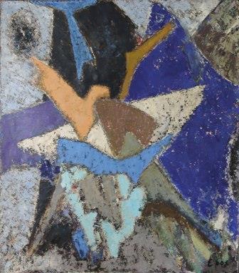
Σ 62 Oil on canvas 146 x 114 cm
1959 Exhibition at the Galerie Synthèse in Paris : two paintings are purchased from the artist by the french Art Museum (MAM)
Σ 61 Oil on panel 37 x 30 cm
Σ 67 “Les Grands Cycles” Enamel on paper 140 x 200 cm
“There is a necessary connection between geometry, aesthetics and metaphysics. Not the purely mathematical geometry, but a symbolic and poetic geometry thar affects the expression of the eternal” Elie Borgrave
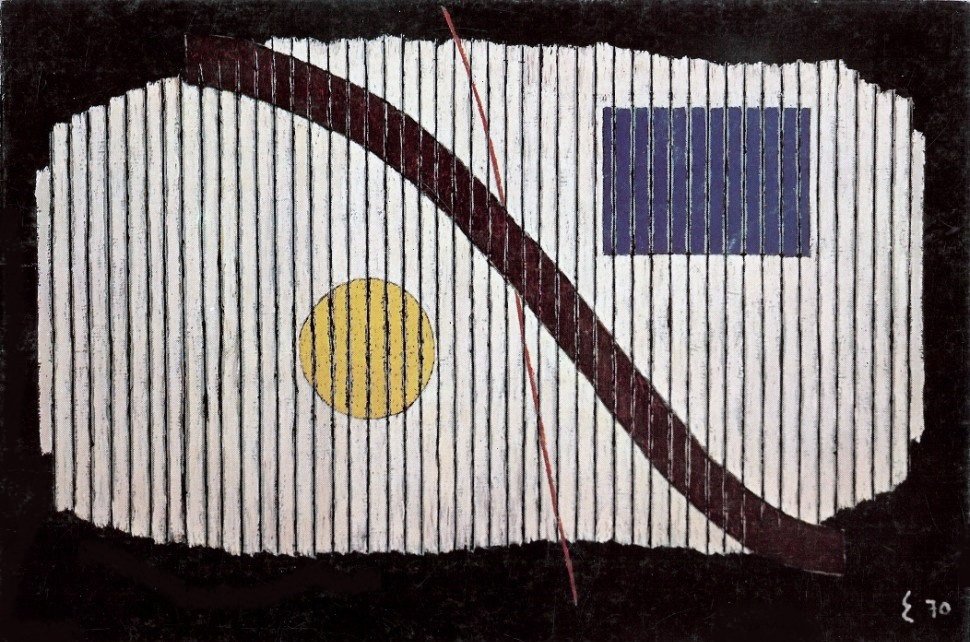
Σ 70 Oil on canvas 130 x 130 cm
In the late 1960s-1970s, Borgrave was recognized in public and private institutions. He exhibited for the second time on solo at the Palace or Fine Arts and various galleries in Brussels. He took part in major collective shows in the Belgian pavilion at the World Fairs held in Montreal and Osaka, and at the Salon de Mai in Paris.
Over the years, the cosmic circles disappeared to make way for syncopated geometrical forms, in a new rythm. Large coloured expanses were traversed by luminous bursts.
“The line is no longer, as in classical geometry, the appearance of a being on the void of the bottom; it is, as in moderate geometries, restriction, segregation, modulation of spatiality.” Elie Borgrave
Σ 77 Oil on canvas 63 x 77 cm
Σ 71 Oil on canvas 50 x 60 cm
“Melody is the clash of colours, while harmony comes from different values of one and the same colour. For a layman, broxn is a colour. For me, brown is the addition of red and orange. This is why my paintings are monochrome, which is to say quests of variants of a colour”
Elie Borgrave
“Because, according to Klee, it no longer mimics the visible, it makes “visible”, it is the blueprint of a genesis of things. Perhaps never before Klee, we had “left a dream line” The line is no longer, as in classical geometry, the appearance of being on the empty background, it is, as in geometry, moderate restriction, segregation, modulation prior spatiality” Elie Borgrave
Σ 59 Oil on canvas 110 x 130 cm
The 1960s were marked by a certain mysticism and faith expressed through figurative ink sketches.
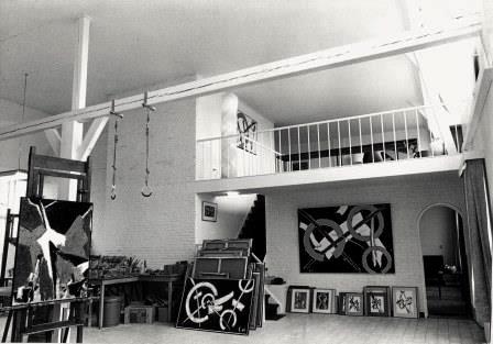
Studio in Zuidzande
Σ 67 ” Les cycles gais” Enamel on cardboard 100 x 140 cm
Σ 71 Oil on canvas 97 x 140 cm
Anthony Spiegeler (2017 “Elie Borgrave” p.219 Snoeck Editions, Ghent, Belgium)
“Geometry gives peace of mind. The artist gives the mind a form in matter. From Georges Braque to Bram and Geer Van Velde, from Wassily Kandisky to Nicolas de Staël, they all participated, through their input, to the construction of his visual grammar. The liberation of the line, the independence of forms and the autonomy of colour were all so many elements in a process of stylistic compilation.”
Σ 71 Oil on canvas 97 x 140 cm
Σ71 Oil on canvas 45 x 49 cm
Σ 72 Oil on canvas 89 x 116 cm
Σ 81 Oil on cardboard 80 x 60 cm
In 1989, Borgrave left his Dutch studio for Brussels until his death three years later. Throughout his life, he had forced his fate by fighting the dogmas and the choices imposed upon him. As a self-taught artist, solitary and idealistic, he did not join any group and he refused to take part in the quarrels indulged in by art theoricians.
Σ 82 Oil on cardboard 90 x 155 cm
“Order, balance, harmony: symbols of peace. This is what I wanted to express in a sparse plastic language that may be related to a certain form of Buddhism.” Elie Borgrave


 Oil on cardboard 110 x 80 cm Coll. N&S B")


 Oil on canvas 130 x 89 cm Bought to the artist by MAM, Paris in 19 Inv. FNAC 27576 in 1961 Fig. 9 p. 19 W. Enzinck , Book p.63 Mairie d’Audincourt,")


 Oil on canvas 79 x 63 cm Coll. AB-BOX")


 Oil on cardboard 19 x 15,5 cm Coll. N&S B, R, Lausanne, CH")